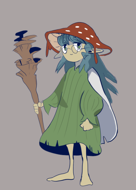
Intro & Inspiration
For the first week of the Art and Animation Fundamentals course we were introduced to photoshop and tasked with creating a concept piece of a character or environment. As it was my first time using photoshop I decided to go with the character concept as I though it’d be more straight-forward and had no ideas for an environment piece at the time. I wanted to base my design off of one of my DnD characters, Morel, a Circle of Spores Druid.
I spent quite a while gathering a decent number of references to aid in designing my character.
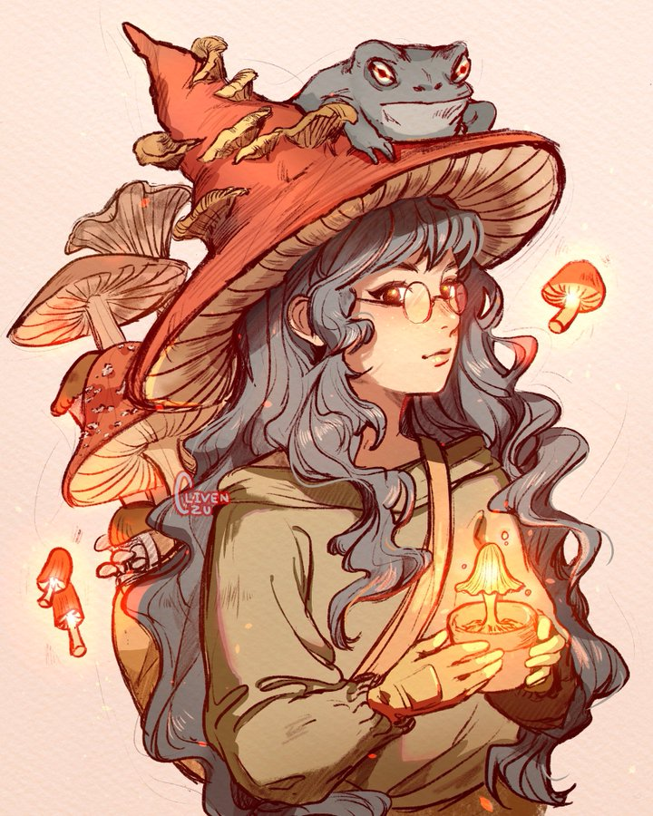
(1) I really liked the colours from this piece, so I kept it as a reference for later on.
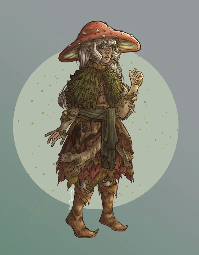
(2) Another reference, I based the mushroom cap off of this particular image.
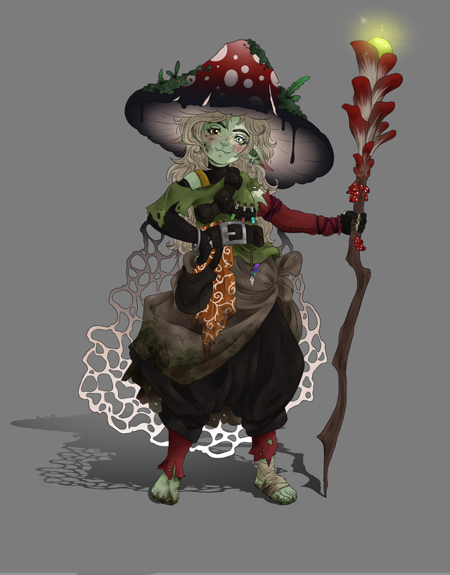
(3) I at first tried incorporating this character’s pose into my drawing but it was a bit too difficult for me to manage the proportions correctly.
Sketch
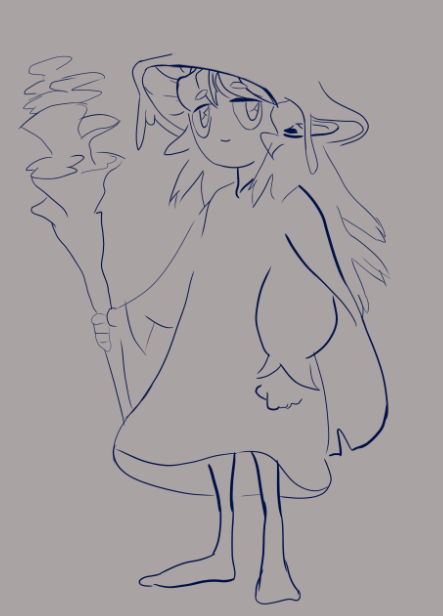
I began sketching some ideas for what the character could look like, heavily relying on the references for shapes and structure. Due to it being my first time using photoshop I was still quite awkward and slow with the shortcuts, causing this part of the process to take quite a bit longer than it probably should have. This meant that for now I had to settle with relatively simple shapes. I tried coming up with ideas for what type of game my character could belong to, and as this concept was based off of my DnD character I found the RPG genre to be quite fitting. Perhaps she could be a friendly npc and quest-giver in some fantasy forest area.
Colour & Shading
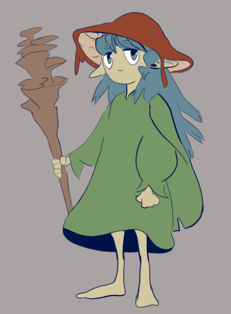
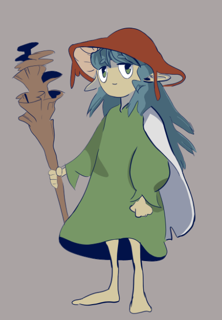
I began this stage by experimenting with some colour schemes, eventually deciding to make the cap red, the hair blue and the clothing green. I tried sticking to the same value and saturation for the different hues I used. Once I was happy with how the colours were starting to look I began shading.
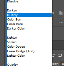
I explored the method of cel shading for this piece as to me it looked like a really good starting point and I felt it would fit the image quite well. To do this I created a clipping mask layer for each separate colour layer, a clipping mask defines the visible boundaries of the layer it is assigned to. Meaning I could easily and efficiently draw over a previously created layer without having to worry about ‘drawing outside the lines’. I used a ‘multiply’ blend mode to add some very simple shading to the character.
Conclusion
After adding in some details I was quite happy with how the drawing turned out. I feel like the result is quite decent despite my lack of experience with the software or drawing tablets. During the latter half of working on this piece I found myself using the shortcuts for the different tools more frequently, such as ‘b’ for the brush tool, ‘e’ for erasing and ‘space’ / ‘r’ for panning around and rotating the canvas.
I wanted to restrict the amount of time I spent on this piece to a single day, however if I had given myself more time or if I decide to come back to this piece later on, some improvements I could make would probably include adding more detail or further explorations into more shading types, such as cross-hatching.
References
(1) clivenzu (2022) [Digital]. Available online: https://twitter.com/clivenzu/status/1062104020397907969 [Accessed 29/09/22].
(2) GrapeToasty (2022) [Digital]. Available online: https://www.reddit.com/r/DnD/comments/fp0xyo/artoc_even_verval_the_decayed_eladrin/ [Accessed 29/09/22].
(3) samydrawsstuff (2022) [Digital]. Available online: https://www.reddit.com/r/goblincore/comments/syi7ns/one_of_my_new_characters_for_dungeons_and_dragons/ [Accessed 29/09/22].